These are my final outcomes of the work based learning.


For the covers I wanted to show how a cover would look like in black and white and in colour. The thing I found most challenging was finding appropriate photographs. For the first cover I went with a black and white moody photograph of a graffiti vandal/artist painting to go along with the street art and graffiti features/spreads in the magazine. The name of the magazine appears in the bottom right hand corner I also added a 1 point stroke to enhance the characters on the grey background. The sheffield college logo appears in b&w in the opposite (top left) corner of the cover 31 mm by 12 mm approx. to be visible as little as possible. For the alternative cover I used a colour image of Pete McKees old people mural in sheffield city centre as the issues interview would be with Pete McKee. The typeface still appears in black with a 1 point white stroke. I think this works effectively with equal attention on the image as well as the name of the magazine which I think is especially important as it is a new magazine.


For the last spread I wanted to do something completely different. I wanted to do a review of a movie that has recently been released but thought that it wouldn’t be about sheffield and decided to do a review of the odeon in sheffield in a feature called honest reviews where I have found reviews from people that have been in the odeon on trustworthy websites and put them on the spread as a running feature of honest reviews where each issue a different place or event in sheffield will be reviewed by the people of sheffield. I decided to not include any pictures of the odeon or the people that did the reviews because everyone knows what the odeon looks like and nobody cares what the people that reviewed it look like. I decided to use some info graphics and clear block colour illustrations. I also chose colours that complimented the odeon cinema and each other.

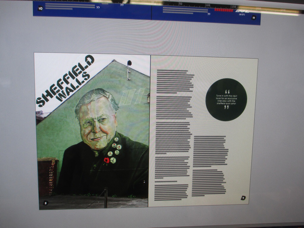
For the second spread I tried a different layout since the content was different. I sourced an article about sheffield art in the streets, including graffiti art and street art. I also found imagery to compliment the article. This time though unlike the first spread were the image was a photograph of the graffiti writer EARY in the background of the interview, the imagery is not directly linked with the article so I thought that instead of having it in the background of the article I could have it on the side of the article. I used colours complementing the photograph to allow the reader to make the connection between the photo and the article identifying the photo as a visual representation of what the article is talking about.

I would like the content to have a clear and clean typeface to look aesthetically pleasing. I know that typeface for the actual content of the magazine is only a little thing but little things like that is what will improve the design. I have looked at many different typefaces and I realise that it might be useful to consider what the spread is about to make the typeface go with it. I have considered serif typefaces but because most of the content of my spreads works with imagery and is quite alternative I don’t think that a serif typeface will work. I decided to go for century gothic in sentence case because it is similar to Helvetia but not as ‘tall’ and ‘thin’ and I think it compliment the alternative approach of the magazine and the creative practices inside it. I though of using a different typeface for each of the spread but decided against to keep a consistency between the spreads .
For the first double page spread I decided to interview a friend of mine who does graffiti in Cambridge and has his tag around everywhere. His name ‘EARY’ is everywhere and you can’t go anywhere without seeing his name. As sheffield is very well known for its graffiti and street art I think this will be an appropriate alternative spread for the magazine and will appeal to the student demographic.

Firstly I thought of just doing a simple design of writing with imagery on the same level with a title and nothing overlaying each other. Just a clear and plain design when I tried this it did not look appealing at all but rather looked very novice. And did not create the creative feel that the interview was meant to reflect.

I decided to think of something else maybe putting an image to the background but one thing I knew for sure was not to overdo it and stay with a clean and simple design.

The top left in the image above is too clattered with imagery in the background and imagery on top as well as text the information will get lost and the viewer will not be able to focus on anything on the spread.
The design to the left of it is my favourite with a few small changes. With an image in the background and working with the image the text aligned to one side and a clear title on top of the page.

What will go inside? Hmm… The alternative spread will be an interview with a graffiti writer from Cambridge which will be a series of “the life of…” Interviews which would feature in the following issues of the magazine and will look at creative practice outside sheffield. I will take my own photography for this spread as well as conduct my own interview with a graffiti writer of my choice.
I will also find an article about graffiti and street art in sheffield and possibly take my own photography of them. If the time allows it.
For the last spread I will do a review in a bit of a different style to the other two of an event or a place in sheffield.
I know that choosing the appropriate typeface will be crucial.

In the image above you can clearly see the typefaces I was deciding between for the name of the magazine. Top to bottom starting from the left column they are as follows:
Baskerville old face
Bernard mt condensed
Birch standard
Broadway
Jellyka western princess
Matura mt script
Modern no.20
Old English text mt
Parchment
Aharoni

These are ones I have chosen out of them. Top to bottom:
Broadway
Jellyka western princess
Matura mt script
Parchment
Some of them look very similar but I realise that the little differences is what will make the name stand out or not. I like broadway because it is bold and the d works well with the edge of the paper also the round full stop compliments the roundness of both e and d.
Jellyka looks like a hand written typeface and out of the four is my least favourite.
The one I will go for is matura because it looks like it is written with a chisel tip thick marker and although it looks very bold it has a sort of edgy personality which I think will correspond well with the arty content of the magazine.
I am not sure if this will work to the favour of the name and the placement of the name but I think it is something I need to consider regardless and that is the addition of signs in front or behind the name.
Signs to be considered are as follows
.
,
?
!
‘
”
–
/
:
;
(
)
|
*
^
_
To try and keep with the simplistic design I will try to stay minimal and only consider a coma, a full stop, a dash, a colon and an underscore out of those.
All of those can be used both in front and behind the word ed to compliment it. I will use a full stop in front of the word (.ed) to show the name as the beginning (because it comes after the full stop) but also the end because it appears in the bottom right corner of the page. The end of the cover and the beginning of the content.
While thinking about the name it is important to consider all the typographic variations to the word. As the word I am using is just two letters long there are only so many option
Ed
ED
eD
ed
I purposely left out the options of flipping the letters in any way as with such a short word it would be over complicating something that I personally think should be kept simple and short just as the word is.
The one that is most appealing to me is the last one which I think is versatile with its use and message that can be put across using both lowercase letters.
